Lead Artist Ben Thompson helps bring to life the charming, physical feel of Hearthstone through his work. In today's blog post, Ben shares his insights on the creation process and artistic approach of one of Hearthstone's most important visual components: the Collectibles.
Hearthstone's approach to how a collectible card game is played is pretty unconventional, so it would stand to reason the art for such game would follow suit. A lot of thought and consideration went into how a game like this looks, feels, and most importantly, plays from a visual perspective. Having Hearthstone look as good and as epic as it played was super important to each of us.
This is the first blog post looking at Hearthstone from an artistic perspective, and we thought it would be interesting to go back and look at the origins of some specific aesthetics in the game. First and foremost among these are the collectibles themselves.
Early in development, conversations centered on the need to make the collectibles for this game as compelling as possible. After all, these pieces represent the minions that make up your army, the weapons and spells by which you do battle, and even the heroes themselves. All of this and more make the collectibles some of the most important visual components in the game.
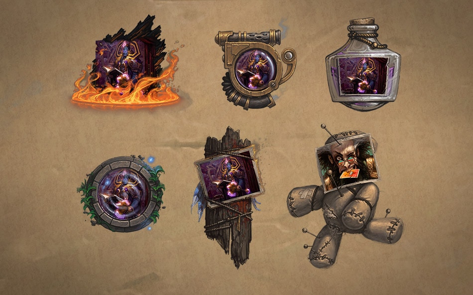
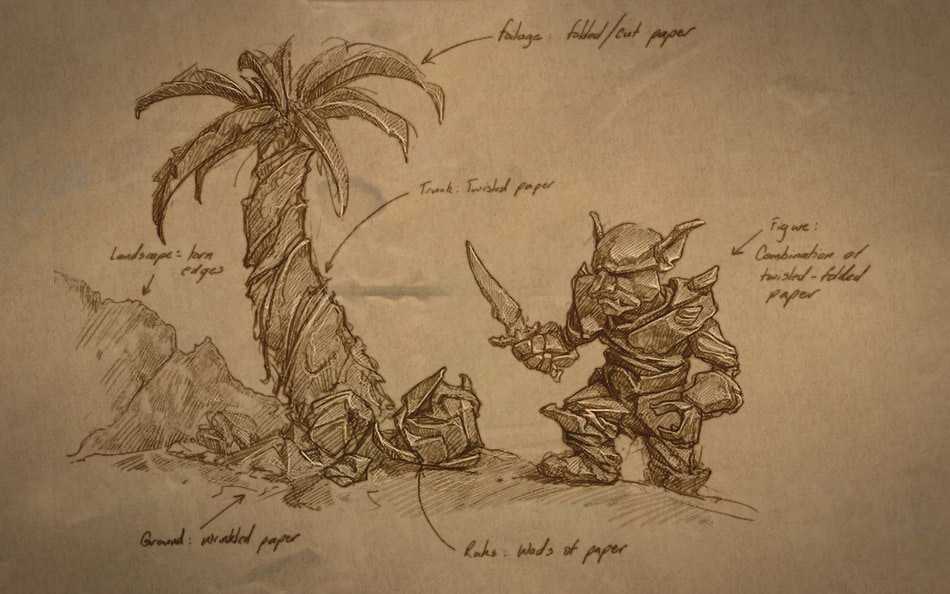
Early on, the sky was the limit and there were no hard-and-fast rules to follow, just the desire to chase whatever sounded awesome to its ultimate conclusion. The key was to iterate quickly and to never let any one idea become too precious. The results of this exercise were varied and included voodoo dolls, gear-driven contraptions, magical jars, moonwells and even papercraft minions. All of these and more made for a variety of hits and misses when judged against their functionality as game pieces.
As we weighed the pros and cons of these early attempts, we learned a lot about what we did and did not want from the collectible. We knew we wanted it to feel like a physical object, that it should definitely feel valuable. But we also knew that the game should absolutely feel as though it belongs in the world of Azeroth. Phrases like “epically charming” and “delightful surprise” were beginning to creep into our game vocabulary, and some of these first collectibles were instrumental in that shift.
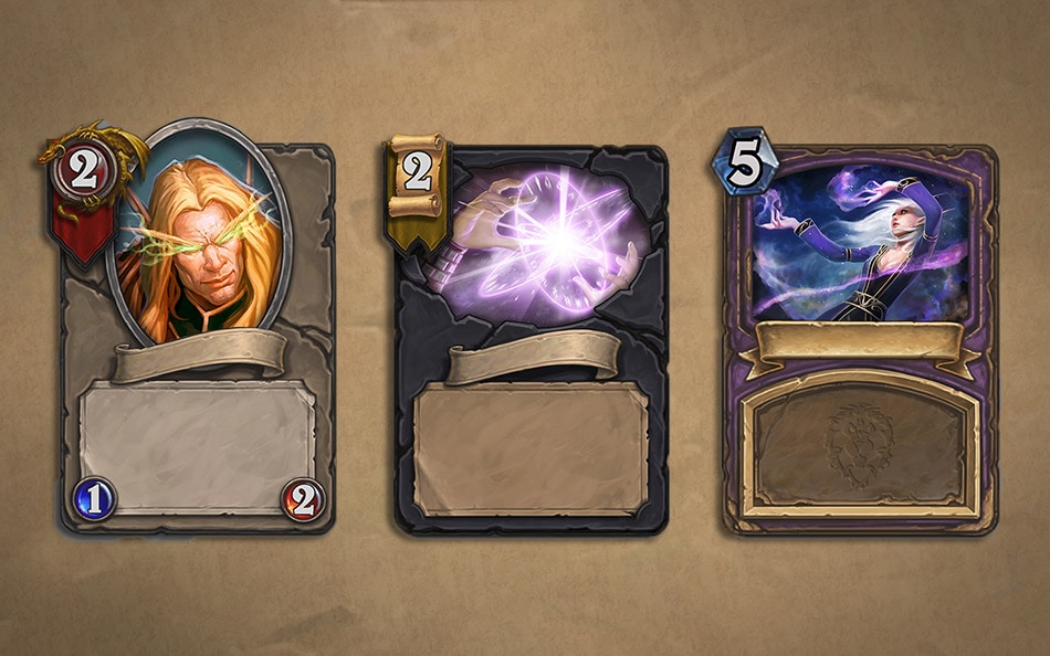
Next we tried a version that embraced the card motif of the collectible, and focused on a simplified, easy-to-read design. These were similar in many ways to cards you see in CCG's today, save that we weren’t constrained by the need to produce these in the real world, allowing for richer materials to be used. They worked better from a readability perspective, but ultimately lacked that spark of "awesome" that we needed to find if these were to be the defining assets in the game. They did however confirm that the cards as a base visual are hard to beat. Everyone intuitively knows what a card is and how it works, and we would continue to leverage this innate knowledge in future designs.
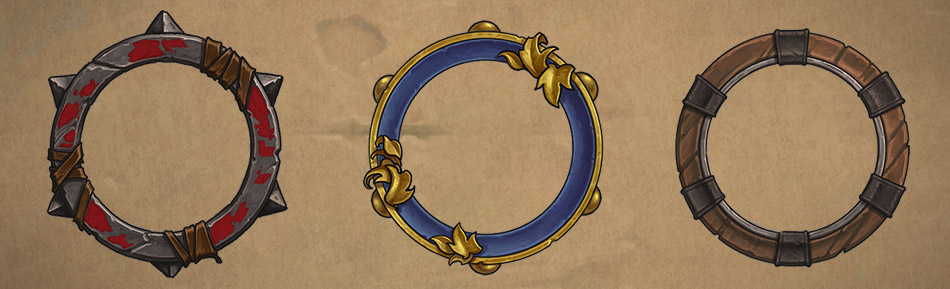
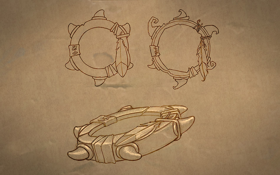
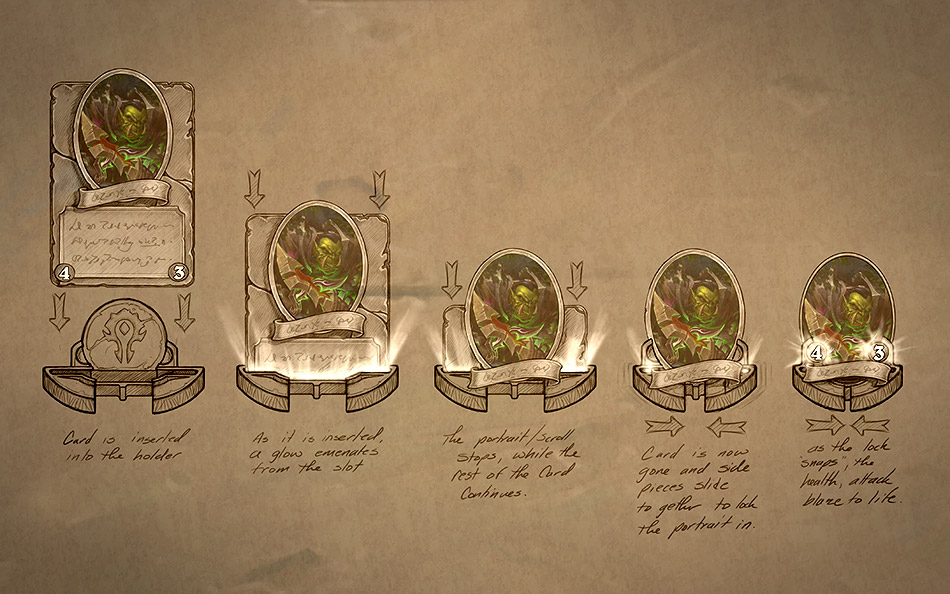
We experimented with a variety of rare and wonderful materials, stacking them on one another and creating an intricately crafted game piece that would make the finest craftsmen in Azeroth gnash their teeth in jealousy. Sadly, it was we who would gnash our teeth as it became obvious you could only fit a couple of these on the play space at one time, and that they were so visually complex that they drew all the attention from the most important parts of a collectible—the attack, health, and casting cost.
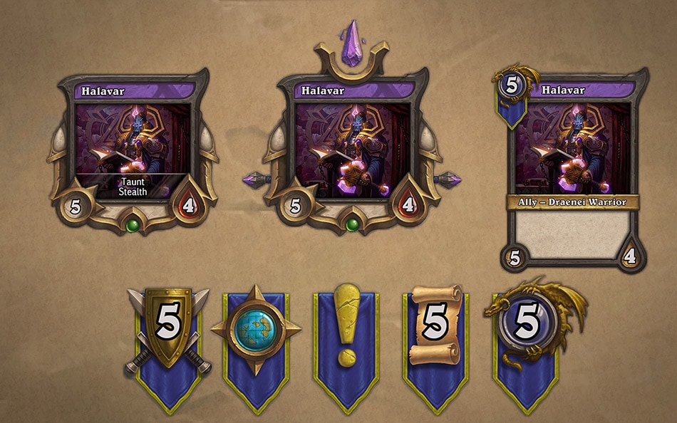
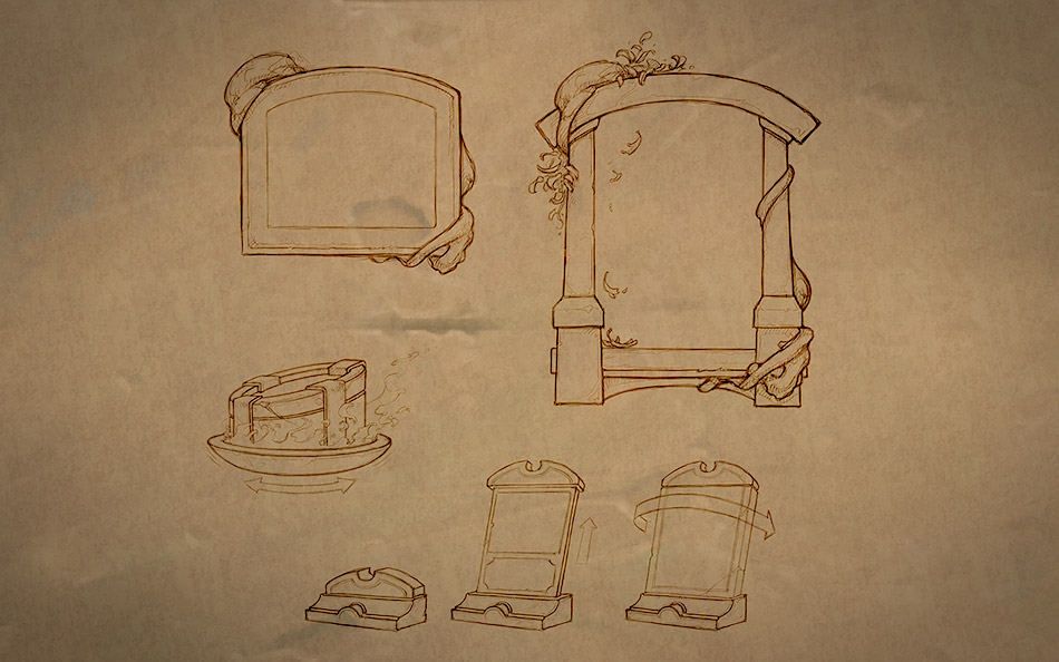
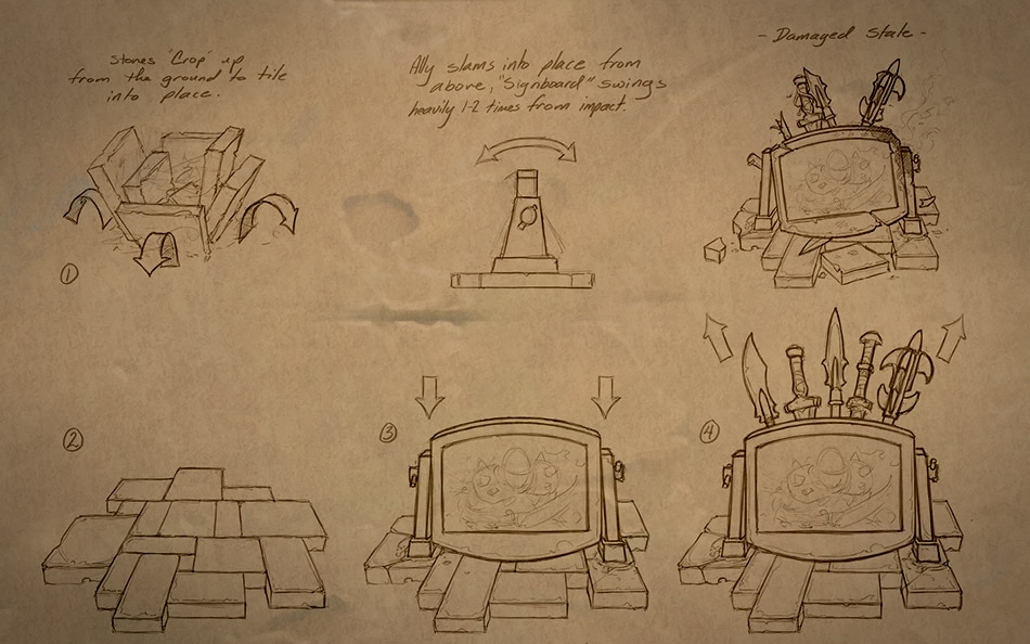
We tried a round that, for the first time, asked the question: "What if the cards changed states after leaving your hand and entering the play field?" We also experimented with the collectibles sharing a visual theme with the race of the character represented in the card. Below are a couple examples with a gnome and a night elf. Additionally, there were some early stabs at spell and weapon cards. The resulting board ended up a bit overwhelming to players as they worked to look past the confusing variety of frames. However, we loved the way the state change embraced the digital space, and worked to integrate that into future versions.

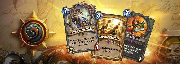
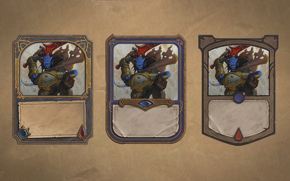
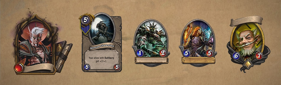
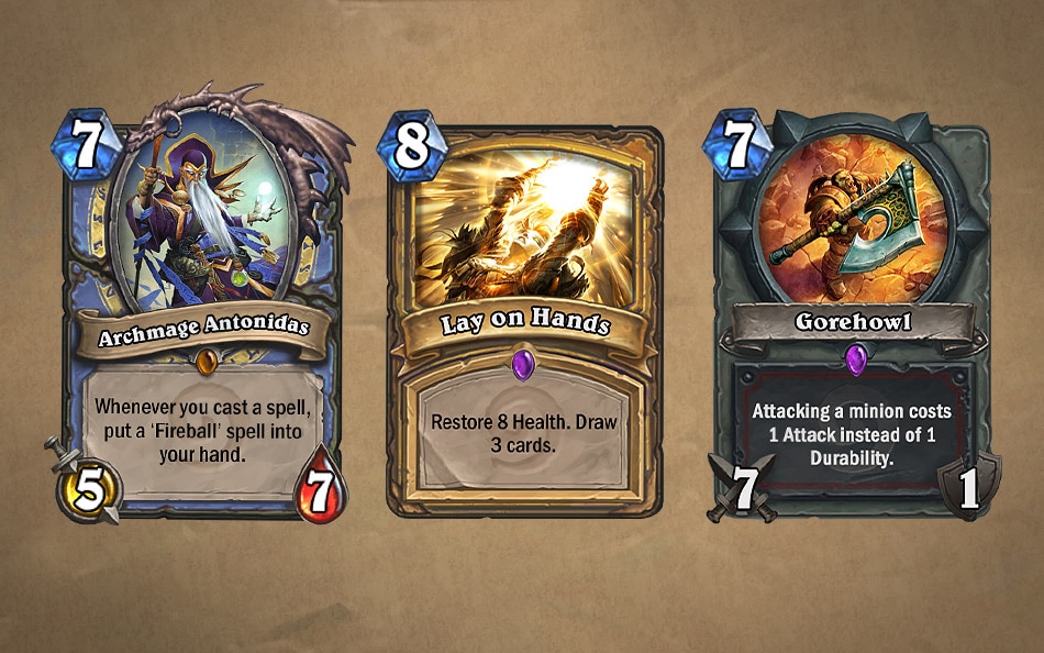
Ultimately we asked ourselves what were the most important pieces of information to convey to the player: the numeric values, the card title, and the card art. Once these three elements were addressed, anything else was seen as a bonus. With that in mind, we worked out a concept that fulfilled all three requirements while simultaneously keeping the in-game asset as simple as possible. The resulting lineup was a hit with the team and ultimately would become the foundation for the collectible as we know it today.
So there you have it! We've walked you through a somewhat abbreviated look at the growing pains Hearthstone has gone through from an art perspective. Here you see the minion, spell, and weapon cards as they look in the game today. Of course, it didn’t take long for the team to ask what our “premium” versions of these would look like. After all, with the freedom provided us by the digital space, we could do so many things . . . gild them in the finest gold . . . animate the card art. . . .
But that’s a story for another time.
-Ben Thompson, Hearthstone Lead Artist
Follow Ben Thompson on Twitter @BenThompsonArt or his website atBenThompsonArt.com